How to Make a Website Accessible: Real-World Guide

Why Website Accessibility Became Your Business Priority
Let's be straight up: web accessibility isn't just a legal hurdle anymore. It's a genuine business opportunity. I've spoken with so many business owners wrestling with this, and the ones who truly thrive see accessibility as a secret weapon. They’re not just dodging legal issues; they’re actively pulling in a bigger crowd.
Think about it: an inaccessible website equals missed opportunities. You’re essentially hanging a "closed" sign on your online shop window, turning away potential customers.
For instance, imagine someone with impaired vision trying to use a site with poor color contrast or missing alt text for images. How frustrating would that be? Chances are, they’ll bounce and find a competitor who values their business. This isn’t some far-fetched scenario; it’s daily life for millions. Plus, an inaccessible site can seriously dent your brand reputation. In a world where inclusivity counts, showing you care builds trust and keeps customers coming back.
This brings us to a key point: the real cost of inaccessibility isn’t just about potential legal headaches. It hits your bottom line directly by shrinking your market and potentially damaging your brand. But smart businesses are turning the tables, using accessibility to boost their revenue. They get that an accessible website unlocks access to a broader customer base and reinforces their brand's value. It’s not about charity; it's about smart business.
The Current State of Web Accessibility
Sure, lawsuits are a factor (and we’ll get to that), but the bigger picture is about ethics and the impact on your business. The need for web accessibility is highlighted by the fact that, despite progress, many sites still struggle to meet accessibility standards.
The WebAIM Million report for 2025 showed that 94.8% of the top 1 million home pages had detectable WCAG 2 issues – a small improvement from 95.9% in 2024. This ongoing problem shows why we need to keep pushing for better accessibility. It's not just the right thing to do; it's often a legal must. ADA Title III complaints, for example, saw a 7% rise in 2024. By prioritizing accessibility, you’re not just reducing risk; you're setting your business up for success in an increasingly inclusive market. Specifically, making your Linkero site accessible expands your reach to every creator, entrepreneur, and small business owner who could benefit from its features.
Mastering WCAG Guidelines Without The Overwhelm
WCAG (Web Content Accessibility Guidelines) can seem daunting, I know. It's easy to get lost in the technical details. But honestly, from my experience, it's much less about memorizing every guideline and more about understanding the core principles and applying them practically to your Linkero site. Let's talk about how to approach the four main principles – Perceivable, Operable, Understandable, and Robust – in a way that actually makes sense.
Prioritizing For Impact
Starting with Level A WCAG requirements is the most effective way to see quick, significant improvements. Think of it like laying the foundation of a house. Things like alt text for images are a simple change, but they unlock your content for people using screen readers. The same goes for color contrast. Improving contrast might seem minor, but it's a game-changer for users with low vision. These seemingly small tweaks have a huge impact.
When you're ready to move on to Level AA compliance, don't feel like you need to do everything at once. Instead, consider your target audience. Since Linkero is geared towards creators and entrepreneurs, focus on elements that are essential for browsing portfolios and product pages. Make those areas shine first.
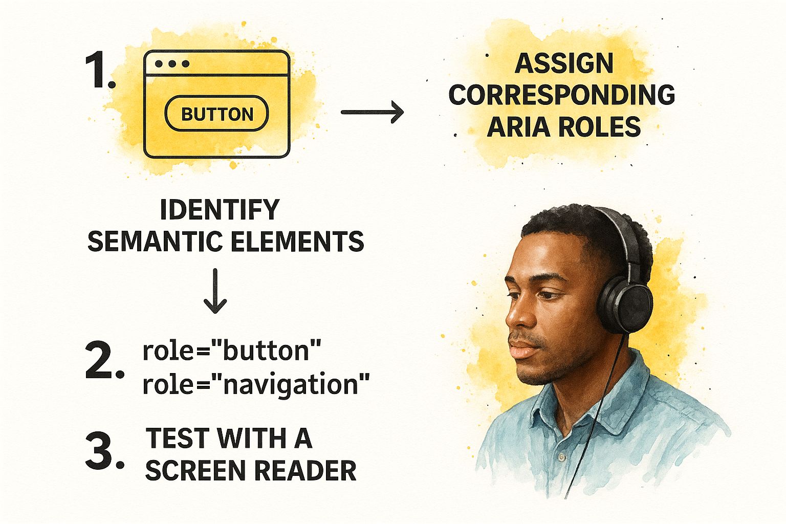
The infographic above shows how to work with ARIA roles: First identify existing semantic HTML, then add ARIA roles only where needed, and always test with a screen reader. This helps make sure your ARIA implementation is actually helping assistive technology users and not creating more confusion.
Avoiding Common Accessibility Pitfalls
I've seen even experienced developers make some classic accessibility mistakes. One of the biggest is overusing ARIA attributes. Often, semantic HTML already provides all the necessary accessibility information. Adding extra ARIA can actually clutter things up for screen readers.
Another common trap is forgetting about keyboard navigation. Remember, not everyone uses a mouse. Every interactive element on your site needs to be accessible using just the keyboard. A simple way to test this is to tab through your entire site. Can you access everything? If not, you know where to focus your efforts.
Just like Pinterest SEO helps search engines like Google and Pinterest understand your content, accessibility helps assistive technologies do the same. Understanding how these platforms affect your business is crucial.
Creating Your Accessibility Roadmap
A good accessibility roadmap fits naturally into your team's workflow. Begin with a site audit to identify the biggest accessibility gaps. Then, prioritize the fixes based on user impact – which issues are creating the biggest barriers for your users? This prioritized list becomes the core of your roadmap.
Break down your implementation into manageable stages. For Linkero users, this could mean focusing on image alt text first, then moving on to keyboard navigation, and finally tackling more complex ARIA implementation. Celebrating these smaller wins helps keep your team motivated.
Building accessibility into your development process isn't just about checking boxes; it's about creating a better experience for everyone. Even small improvements make a big difference in overall inclusivity.
To help you visualize and prioritize, I've put together this table:
WCAG 2.1 Compliance Levels and Implementation Priority
| Compliance Level | Key Requirements | Implementation Difficulty | User Impact | Priority |
|---|---|---|---|---|
| Level A | Alt text for images, sufficient color contrast | Low | High | Highest |
| Level AA | Keyboard navigation, consistent page layouts | Medium | High | High |
| Level AAA | Very specific contrast ratios, sign language interpretation for pre-recorded video | High | Medium | Medium |
This table summarizes the key differences between the WCAG levels and emphasizes the importance of focusing on Level A and AA criteria first because of their high impact and relatively lower implementation difficulty. Starting with these levels offers the biggest accessibility improvements for the effort involved.
ARIA Implementation That Actually Helps Users
The screenshot above, from Mozilla's developer documentation, gives you a good breakdown of the different ARIA roles, states, and properties. It really highlights how comprehensive ARIA is and how it can bring semantic meaning to web elements. This is a great resource for getting a handle on how ARIA fits into the bigger picture of accessibility. Now, let's talk about how you can actually use this stuff on your website.
When To Use (And Not Use) ARIA
I've seen it happen so many times: ARIA overuse. It’s tempting to throw aria attributes on everything, thinking it’s some magic accessibility wand. But honestly, good old semantic HTML often already does the trick. A <button> element, for instance, is already a button! You don't need role="button". Adding extra ARIA can sometimes even confuse screen readers. It’s like adding way too much salt to a perfectly good steak – it masks the natural flavor.
So, when should you use it? ARIA is essential when you’re building custom components or dealing with elements that don't have built-in semantic meaning. Imagine you’re building a custom tab panel on your Linkero site. ARIA attributes like role="tablist", role="tab", and role="tabpanel" are your lifeline. They tell assistive technologies what's going on, so screen reader users can actually navigate the tabs and understand their relationship to the content.
Real-World Examples on Linkero
Let’s say you're making a collapsible accordion. Just using a plain <div> for each section doesn’t tell a screen reader that it expands. This is where ARIA shines. Using role="region" for the accordion section and aria-expanded="true/false" on the button that controls the expansion gives crucial context. These attributes let assistive technologies know that the section can expand or collapse and what its current state is. Linking the button and the content with aria-controls just makes the experience even smoother.
Another example? Custom alert messages. A <div> with an error message isn’t enough. Using role="alert" guarantees that screen readers announce the alert immediately, so users don’t miss key info. This is especially helpful for form validation on your Linkero pages.
Testing Your ARIA Implementation
Here’s the deal: Never just assume your ARIA is working correctly. Always test with a real screen reader. NVDA, JAWS, and VoiceOver are good options. Navigate your site using just the keyboard; that’s how many screen reader users do it. Pay close attention to how the screen reader interprets your ARIA. Does it make sense? Any weird or repetitive announcements?
By keeping real-world use cases in mind and testing thoroughly, you can be sure your ARIA implementation actually helps users on your Linkero site. Don’t let ARIA become another accessibility roadblock. Use it strategically to make your site more inclusive and user-friendly.
Designing Beautiful And Accessible Interfaces
The idea that accessible design is boring is just plain wrong. I’ve seen some seriously stunning interfaces that are also incredibly inclusive. It's not about seeing accessibility as a constraint, but rather a chance to get even more creative. So, how do you make your Linkero site beautiful and accessible? Let's dive in.
Color Palettes That Pop (And Pass Contrast Checks)
Accessible color palettes don't have to be dull. It’s about striking the right balance. Tools like WebAIM's Color Contrast Checker are essential for making sure your text and background colors meet WCAG guidelines. But here’s a tip from experience: don’t just use the checker. Try your colors on different devices and in different lighting. You'll be amazed how colors shift between a phone and a laptop, especially in bright sunlight. This real-world testing helps you tweak your palette for optimal accessibility and visual impact.
For example, let’s say your brand uses a light blue. Pairing it with dark gray text might seem fine on your computer. But take your phone outside. Does the contrast disappear in the sun? If so, try a slightly darker blue, or maybe bolder text. This is the kind of detail that makes a design truly accessible and user-friendly. Remember, this goes for everything - buttons, links – they all need enough contrast, both normally and when you hover over them.
Focus Indicators That Enhance, Not Distract
Focus indicators are a must for keyboard users. They pinpoint where the keyboard focus is on the page. But poorly designed ones can be distracting. The trick is to design focus indicators that blend with your overall visual design. Instead of a harsh, thick outline, think about a subtle background color change or a soft glow around the focused element. Linkero's design flexibility makes this kind of customization easy, so you can create focus indicators that match your brand and improve usability.
You might find some inspiration in these Website Layout Design Examples – they showcase accessible design principles woven into visually appealing layouts.
Layouts That Flow For Everyone
Accessible layouts are all about intuitive navigation, no matter how a user interacts with your site. Mouse, keyboard, assistive technology – it should all feel natural and predictable. Think carefully about how elements are arranged on the page. Clear visual cues, like headings, whitespace, and consistent spacing, will guide users through your content. Avoid overly complex layouts that can be confusing, particularly for screen reader users.
This connects directly to designing for different screen sizes. Your Linkero site needs to be responsive, adapting smoothly to different devices. Test your layout on desktops, laptops, tablets, and phones. This ensures a consistent, accessible experience across the board. Investing in website accessibility is becoming increasingly important for businesses. The global market for web accessibility software is expected to reach nearly $1 billion by 2031. This highlights the growing importance of accessibility and aligns with the $13 trillion global spending power of people with disabilities and their families. Discover more insights. Also, if you’re looking to enhance user interfaces, you might consider the design principles behind effective QR Codes.
By focusing on these elements, your Linkero site will not only look great but will also be genuinely inclusive and accessible for everyone.
Testing Strategies That Uncover Real Issues
Automated accessibility testing tools are handy, sure. They'll flag the obvious stuff, like images missing alt text or color contrast that's less than ideal. But honestly, they're just a starting point. From my experience, they only catch about 30% of actual accessibility issues. So, where's the other 70% hiding? It's in the nuances of manual testing and the reality of user experience.
Beyond Automated Checks: The Power of Manual Testing
For true accessibility, especially on a Linkero site where you’re crafting something unique, you need to dig deeper. Take keyboard navigation, for example. Can you tab through every interactive element on your Linkero page without getting stuck? Automated tools might miss a button that looks focusable but doesn't actually work with a keyboard. For users who rely on keyboard navigation, this is a deal-breaker. Manual testing is the only way to be certain everything works as it should.
Screen reader testing is another critical area. NVDA might interpret your code one way, while JAWS delivers a completely different experience. Testing with various screen readers is essential to understand how different users perceive your content. It’s a crucial part of building a truly accessible website.
And don't forget about users with cognitive disabilities. Is your language clear and straightforward? Is the information presented in a way that's easy to understand and follow? Automated tools can't gauge the cognitive load of your content. Manual testing, ideally with users from your target audience, helps you spot areas that might be confusing or need simplification.
Building Your Accessibility Testing Toolkit
Luckily, there are plenty of tools, both free and paid, that can help. Here are a few of my go-to resources for accessibility testing:
To help you navigate the options, I've put together this comparison table:
Essential Accessibility Testing Tools Comparison:
| Tool Name | Type | Cost | Key Features | Best For | Limitations |
|---|---|---|---|---|---|
| WAVE | Automated | Free | Identifies errors and alerts | Quick initial scans | Misses nuanced issues |
| axe DevTools | Automated | Free/Premium | Browser extension, detailed reports | Integrated development workflow | Limited scope without premium features |
| NVDA | Manual (Screen reader) | Free | Open-source, highly customizable | Windows users | Requires practice and familiarity |
| JAWS | Manual (Screen reader) | Paid | Powerful features, widely used | Professional testing | Costly |
| VoiceOver (MacOS/iOS) | Manual (Screen reader) | Built-in | Integrated into Apple devices | Mac and iOS users | Platform specific |
This table highlights the strengths and weaknesses of different approaches. While automated tools provide a quick overview, manual testing, especially with assistive technologies like screen readers, provides deeper insights into the actual user experience.
Prioritizing Fixes Based on Real Impact
Even with increased awareness around accessibility, many users still face significant hurdles. For example, 42.3% of users with accessibility needs haven't seen any improvement in web accessibility in the last year, and 18.5% believe it has actually gotten worse. These numbers highlight the need for continuous evaluation and improvement. You can learn more about web accessibility statistics and trends for a broader perspective.
So, where should you start with fixes? Prioritize issues with the greatest impact. A minor color contrast issue on a rarely-visited page is less critical than a keyboard navigation problem on your main call to action. Focus on how these issues affect real people using your Linkero site. This user-centered approach, combined with a mix of automated and manual testing, is far more effective than simply aiming for a perfect compliance score.
Speaking of user experience, for those of you interested in measuring website performance in general, I recommend checking out this article on website performance metrics. It's packed with useful tips for optimization. By focusing on accessibility, you're not just ticking compliance boxes; you're genuinely improving the experience for a larger audience and building a more inclusive Linkero site.
Building Accessibility Into Your Development Process
Let's talk about baking accessibility right into your website's DNA. It's not a sprinkle-it-on-later kind of thing; it’s a core ingredient. From my experience, I know it's totally doable to integrate accessibility into your workflow without slowing things down. It's about fostering a culture where inclusive design is simply the default.
Creating Accessibility Guidelines Your Team Will Actually Use
Ditch the massive, complicated manuals that no one ever reads. Useful accessibility guidelines are short, sweet, and easy to find. Think about the everyday accessibility hiccups your Linkero team might encounter, like image alt text, color contrast, keyboard navigation, and proper ARIA usage. And don't just talk in general terms; give specific examples related to Linkero. For example, when explaining alt text, show how to describe portfolio images or product photos.
One handy trick is a quick-reference checklist. This makes accessibility checks a normal part of the development routine. Making these guidelines easy to access and relevant to the team's daily grind is what gets them used.
Establishing Effective Review Processes
Finding accessibility issues early is like dodging a bullet. It saves so much time and frustration later on. Make accessibility a standard part of your code reviews. Encourage your team to check each other's work with accessibility in mind. Even simple questions like, “Can I use this with only my keyboard?” can uncover hidden problems.
For more involved features built with Linkero's advanced tools, consider dedicated accessibility reviews. Having a designated accessibility expert during these reviews can catch those trickier issues.
Building a Culture of Inclusive Design
Accessibility becomes second nature through education and awareness. Regular training focused on practical skills and real-world scenarios makes all the difference. Sharing success stories and celebrating accessibility milestones is huge. When accessibility is seen as a positive contribution, not a chore, your team will really get behind it.
For smaller businesses aiming for growth, inclusive design can be a game-changer. Pairing this with smart marketing can supercharge your efforts. Check out this post for some ideas: Proven Small Business Marketing Strategies That Drive Growth.
Working With External Partners
When bringing in outside developers or designers, be upfront about your accessibility expectations. Put these requirements in your contracts. Share your team's accessibility guidelines and offer support as they build. This keeps everyone on the same page from the get-go.
Maintaining Accessibility Standards
Websites are always changing. New content, updated features, fresh designs – it’s a constant evolution. Integrate regular accessibility checks into your maintenance routine. Automated scans are great for catching common issues, but manual testing is key for those more subtle problems.
Measuring Your Progress
Tracking your accessibility progress keeps the team motivated and gives you valuable insights. Use analytics to see how people with disabilities interact with your site. Monitor how many accessibility issues you’re finding and fixing. This shows you where you’re succeeding and where you need to focus. Celebrating even small wins reinforces how important accessibility is and encourages ongoing effort. By weaving these practices into your workflow, you create a culture where accessibility is a natural part of building a great user experience for everyone on your Linkero site.
Your Practical Accessibility Action Plan
So, we've covered the why and how of web accessibility. Now, let's get down to brass tacks and create a realistic action plan for your Linkero site. I know this can feel like a mountain to climb, but trust me, we can break it into manageable chunks. We’ll start with quick wins that give you immediate results and build from there. It’s like building a house – you wouldn't start with the roof, right?
Phase 1: Quick Wins For Immediate Impact
This phase is about grabbing the low-hanging fruit – changes you can make today that have a huge impact.
- Image Alt Text: Seriously, every single image needs descriptive alt text. On your Linkero site, this is especially important for portfolio pieces and product photos. Imagine someone using a screen reader trying to understand your work – without alt text, they're completely in the dark!
- Color Contrast: Grab a contrast checker and test your text and background colors. Aim for WCAG Level AA contrast ratios. This makes a world of difference for readability, particularly for users with low vision.
These two simple steps are the bedrock of your accessibility journey. They’re quick to implement and deliver instant benefits for your users, building momentum for the next phase.
Phase 2: Enhancing Usability and Navigation
Once the basics are covered, let’s make your site easier to navigate and use for everyone.
- Keyboard Navigation: Can you navigate your entire Linkero site using only your keyboard? Give it a shot. Tab through every link, button, and interactive element. If you hit a snag, you've found an accessibility issue.
- Meaningful Link Text: "Click here" is so last century. Use descriptive link text that tells users where they're going. Instead of "click here", try "Visit the Linkero homepage."
These improvements not only boost accessibility but also make the user experience smoother for everyone. For more web development insights, check out these articles on add-to-calendar-pro.com. They’ve got some great stuff.
Phase 3: Deep Dive and Ongoing Improvement
Time to roll up our sleeves for some deeper testing and tackle more complex accessibility issues.
- ARIA Implementation (Where Needed): ARIA attributes add context for assistive technologies. Use them strategically for custom components or elements lacking built-in semantic meaning. Don’t go overboard though – semantic HTML often gets the job done.
- Testing with Assistive Technologies: Using screen readers like NVDA or JAWS lets you experience your site from the perspective of a user with a visual impairment. This can uncover issues that automated tools might miss.
Accessibility is a journey, not a destination. Regularly review and update your site with accessibility in mind. As your Linkero site grows and changes, make sure new content and features maintain the accessibility standards you’ve worked hard to establish.
By taking this phased approach and focusing on practical steps, you can make real strides toward a more accessible and inclusive Linkero site. Ready to make your website more welcoming? Create a stunning and accessible site with Linkero today.


